Close
Role
Product Designer—user research, design, copywriting, prototyping, and user testing
Client
Manchester City Football Club came to us with the challenge of onboarding fans to their first online ticket renewal sales platform. Through gentle guidance and proactive feedback, the club saw 80% of their renewals migrate online while total renewals increased by 15%.
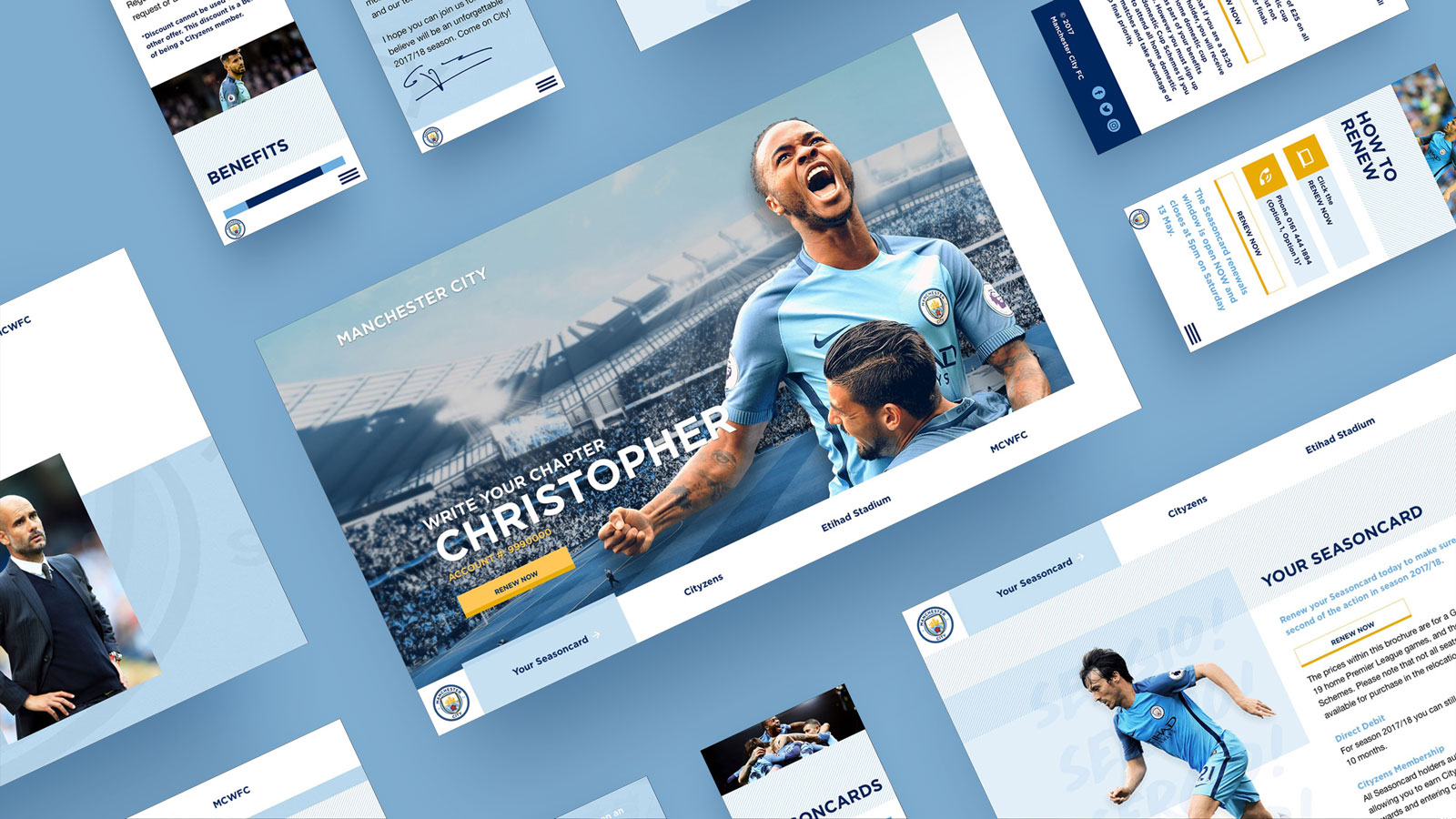
How might we ease users into change when change is inevitable? Ultimately, it would be our users that would teach us how. For my part, I led our design, copywriting, and research efforts.
To begin, we decided to reach out to football clubs that had gone through similar transitions. Though unable to connect directly with their ticket holders, the clubs provided valuable insight which we divided into three phases.
AFFINITY DIAGRAM OF FEEDBACK
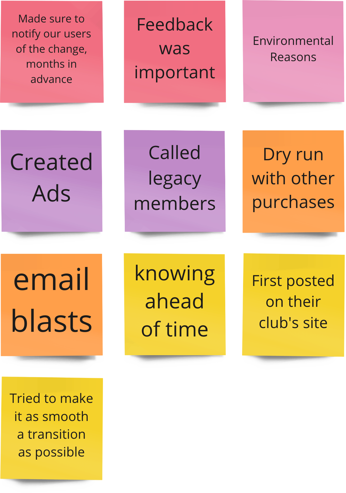
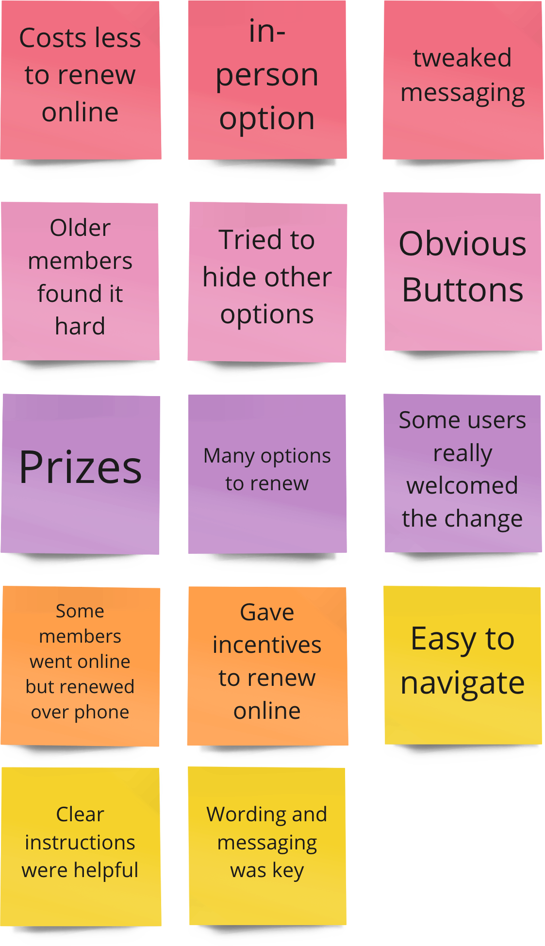
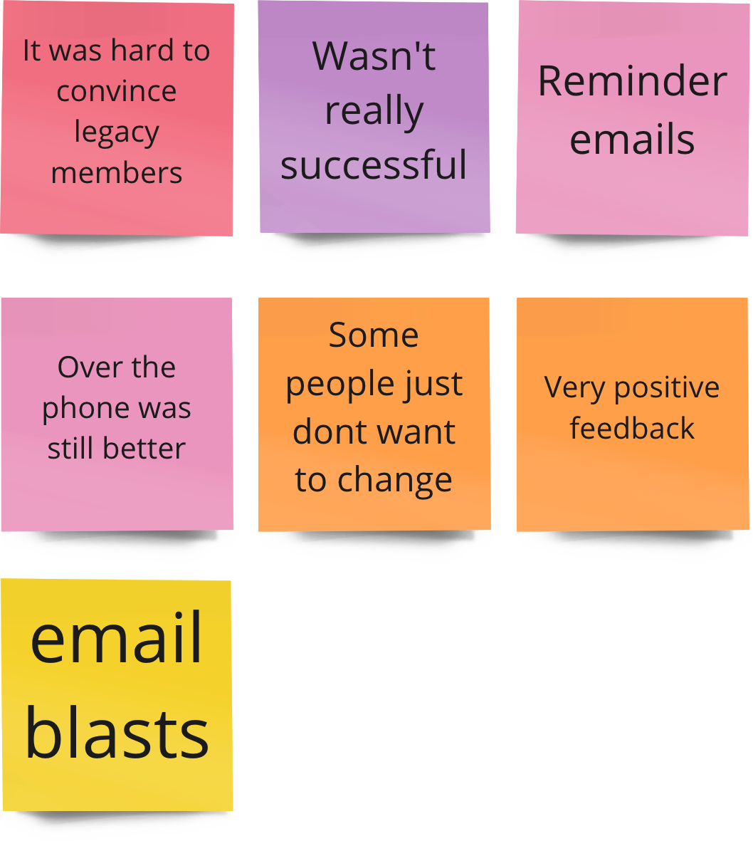
One of the biggest takeaways from our discussions was that by first hinting to users that a change was coming, a much less abrupt transition occurred. Simply put, it was easier to prepare for change when you knew it was coming.
To that end, we asked Manchester City season ticket holders to provide feedback on what an online renewal experience might look like—subtly preparing them for what was to come. In doing so, we narrowed down content architecture and highlighted usability concerns. With the inevitability of interacting with an unfamiliar website, users wished for simplicity and accessibility above all.
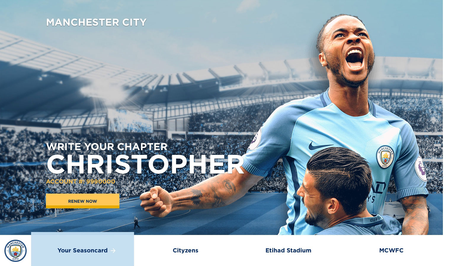
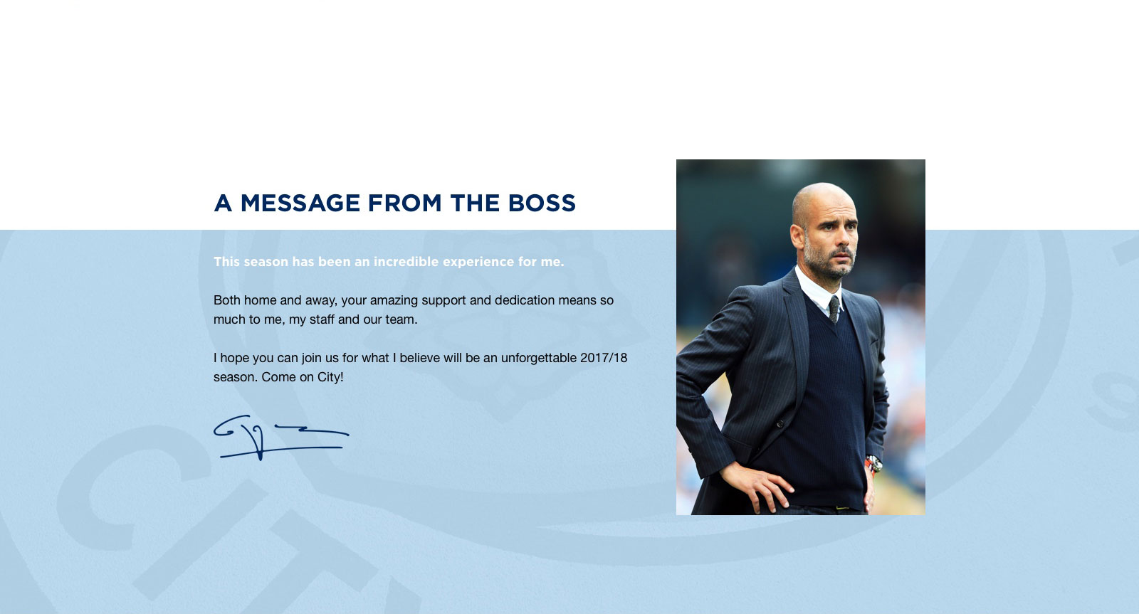
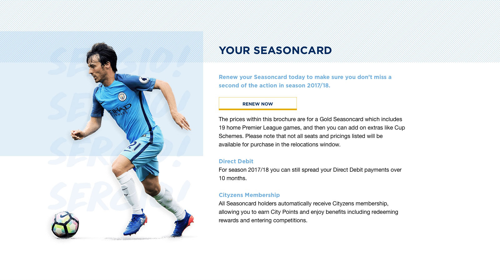
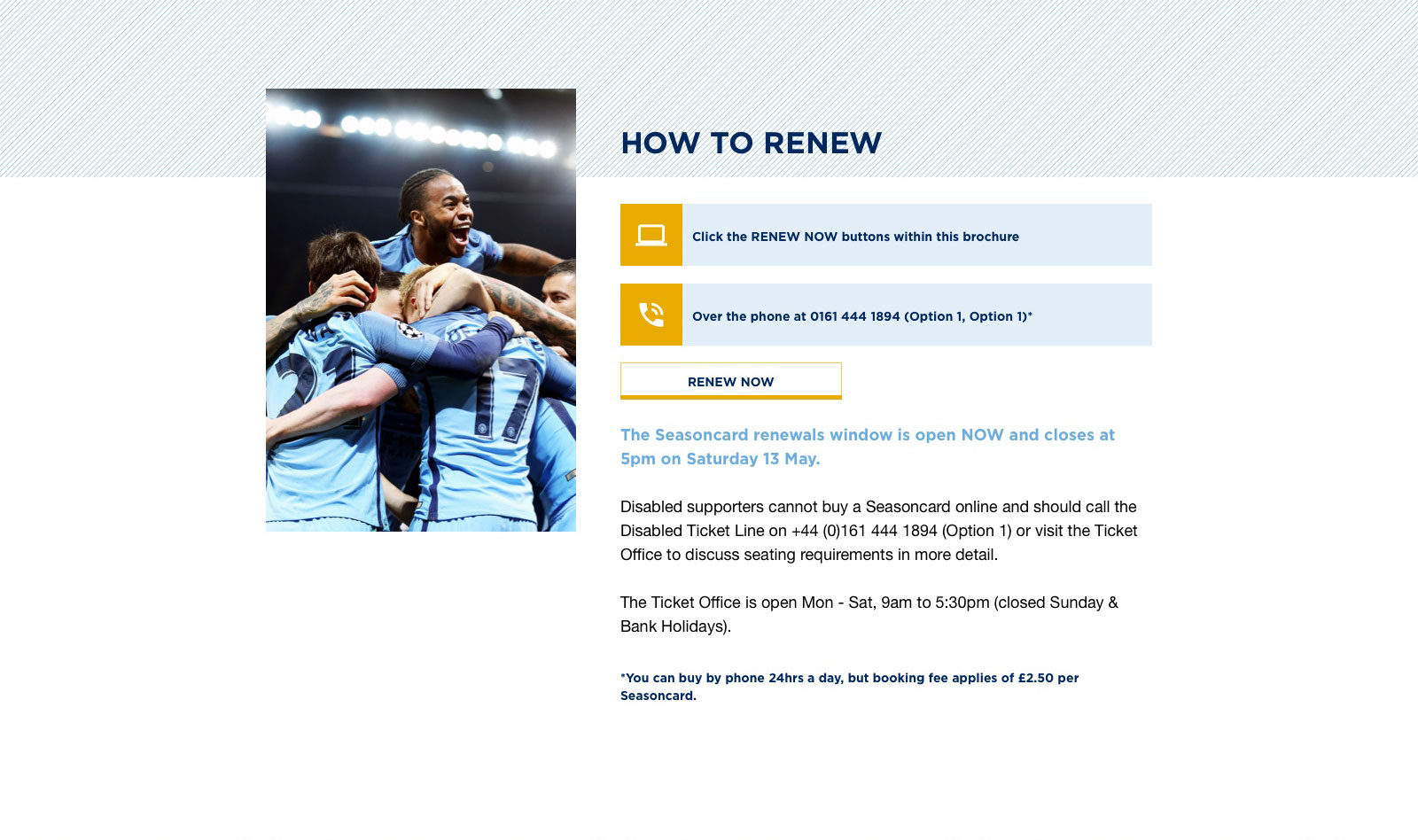
Tapping into this further, we tested landing page prototypes and invoice samples which attempted to streamline this process—the simpler the design, the better it tested. Again, this further familiarized users with the process.

"Simple. That's it."

“I like mailing it, I don't want to have to change.”

“Something new and fresh would be nice.”
When the time finally came to introduce the change, careful consideration was made with regard to messaging. Recalling my younger days as a customer service rep, I emphasized the need for acknowledgment and empathy.
Sample Email
“We understand change isn’t always easy. Just as you’ve watched us change and grow since our founding in 1880, so too has our way of renewing season tickets. This year, we’re going online. It’s as simple as clicking Renew Now. But not to worry, we’re also here to help. You can always reach out to your dedicated sales rep should you trip up or run into any tackles.”
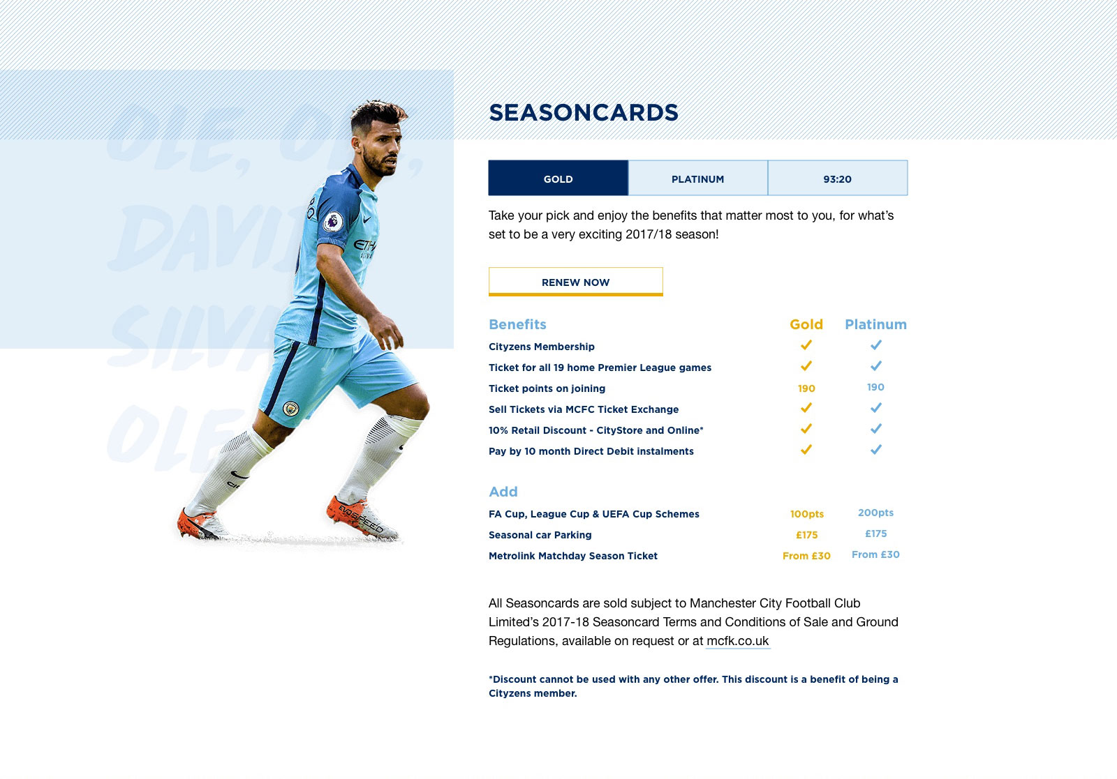
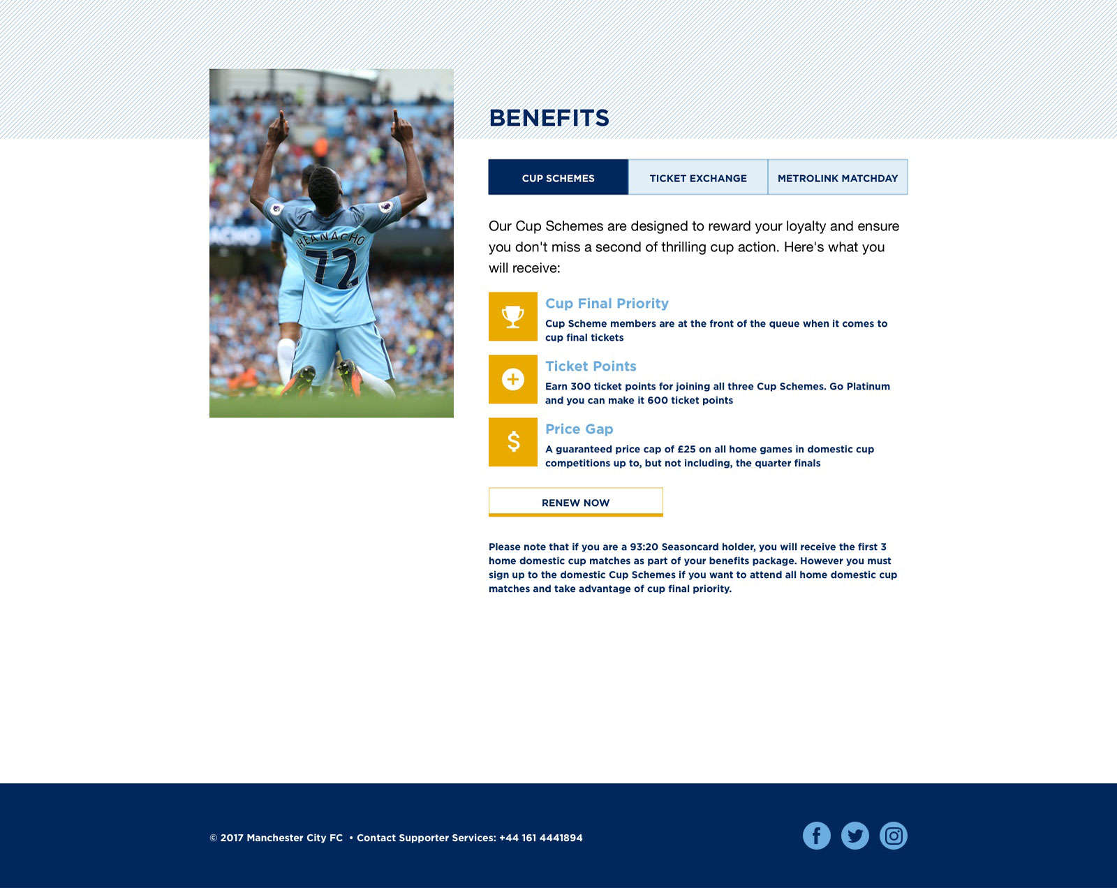
Lastly, following up with users was equally as important as the previous two phases. The reality is that you will always have early adopters and laggards. We asked those that didn’t renew online what prevented them from doing so and how we could improve the process the following year. Though gathering this feedback was helpful, it also provided further acknowledgement and empathy towards our users, easing them into next year’s renewal.
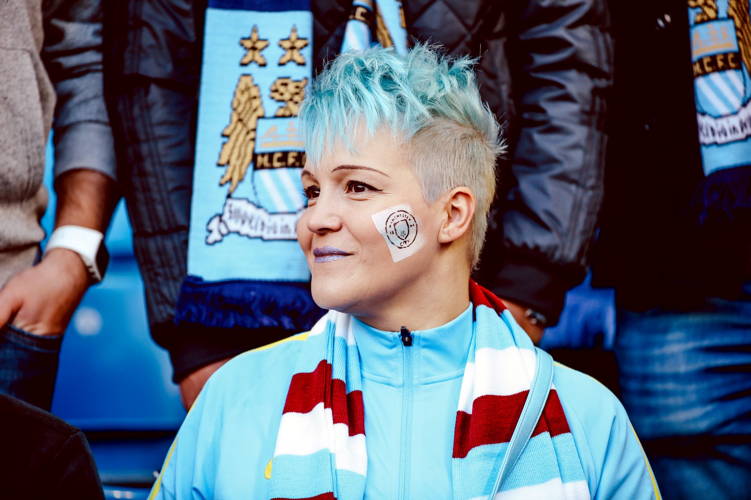
Creating accessible and streamlined experiences should always be at the forefront of product design. However, carrying our users through the changes we introduce is just as important for a full product experience. Thus, it was through a proactive approach in directing that change that Manchester City Football Club saw 80% of their renewals migrate online, while total renewals increased by 15%.
In essence, guidance helps form relationships. By acknowledging concerns while demonstrating empathy, trust can be established. After all, change is much easier to accept when you’re ready for it.