Close

Role
Product Designer—user research, design, prototyping, and user testing
Client

Through contextual research, user interviews, and user testing, we broke down the root causes for why users were dropping off during the sponsorship presentation process. By designing a dashboard that better met users' needs, we doubled conversion rates, increased engagement by 90%, and helped Flash Entertainment secure naming rights for Abu Dhabi’s $3B venue, Etihad Arena.
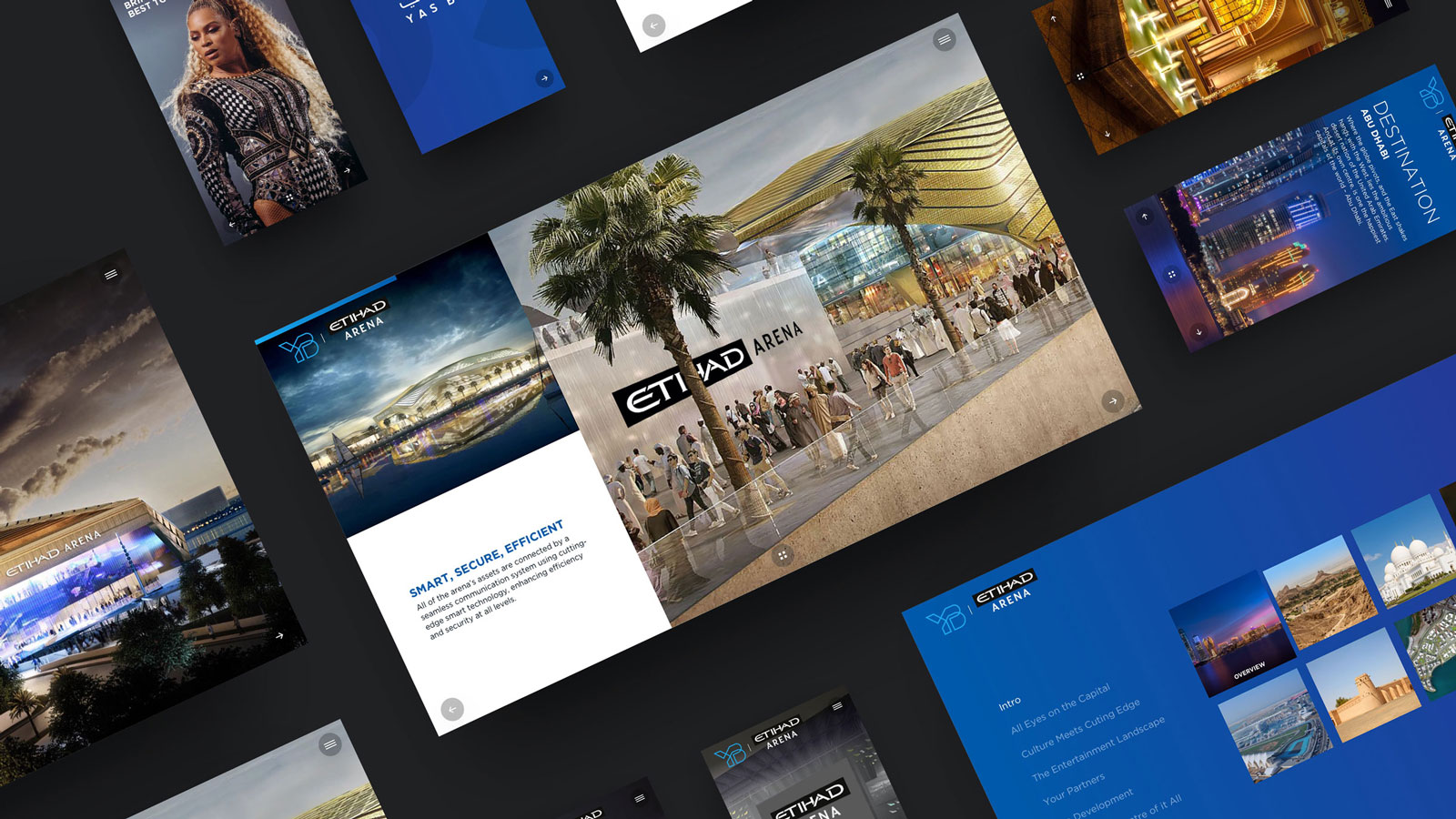
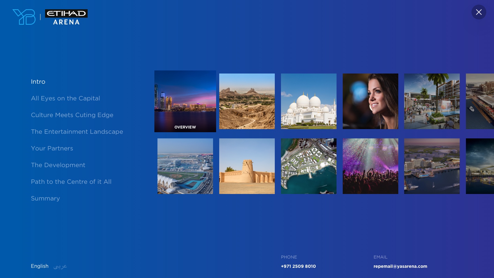
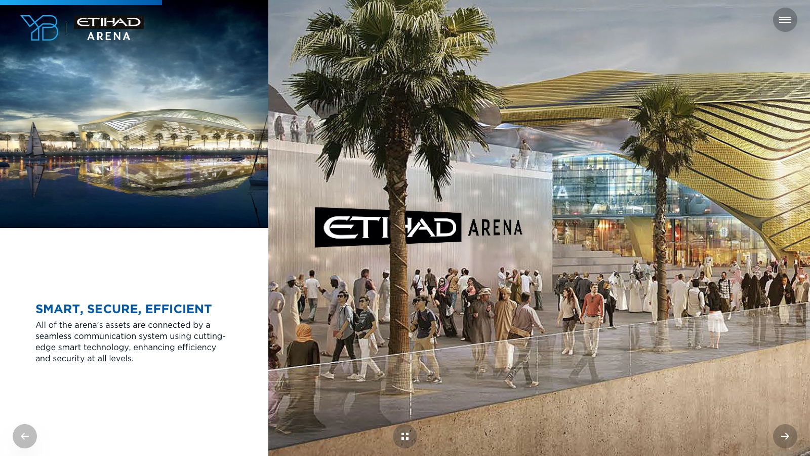
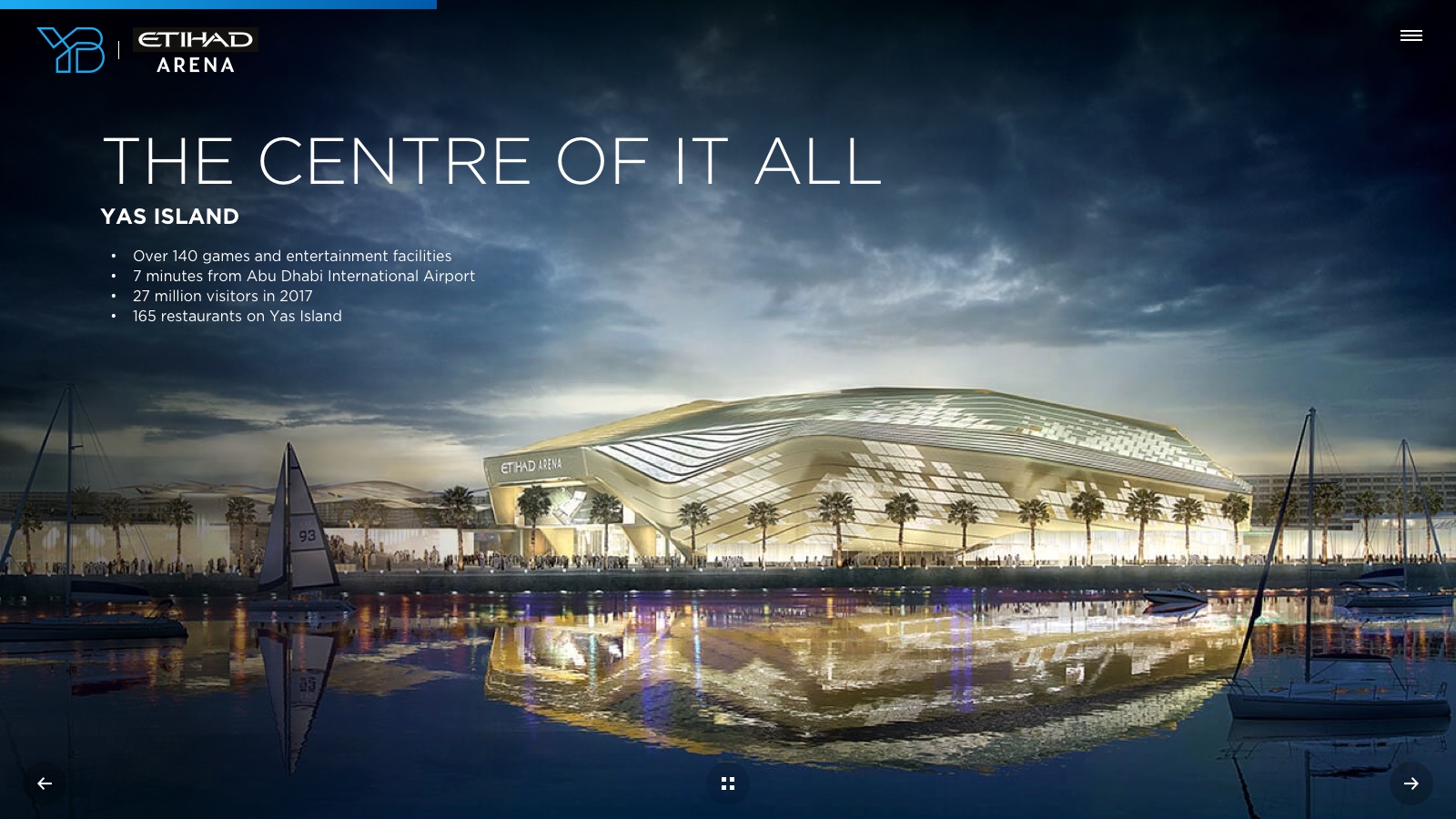
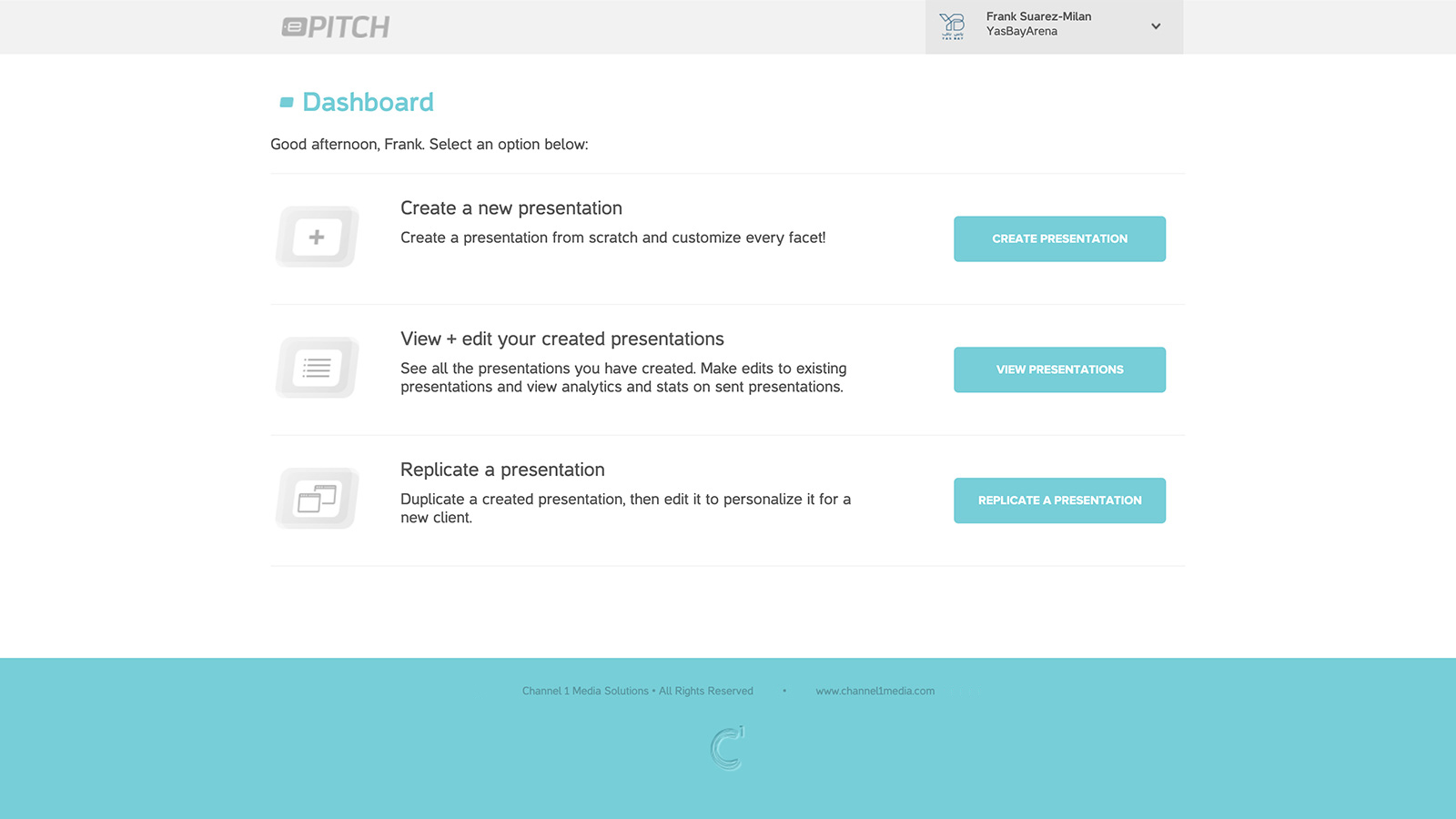
Catering predominantly to the sports and entertainment industry, ePitch serves up sales-ready presentations for clients seeking sponsorship. With a single logo upload users can generate hundreds of branded product images on display as a custom-built website. This saves both time and effort, but also eliminates the need for any Photoshop work.
Although creating sponsorship presentations was at the core of ePitch, we found that most users dropped off before accomplishing this. How could we increase conversion rates and reduce drop-offs? I led the design efforts and facilitated our Sprints to find out.


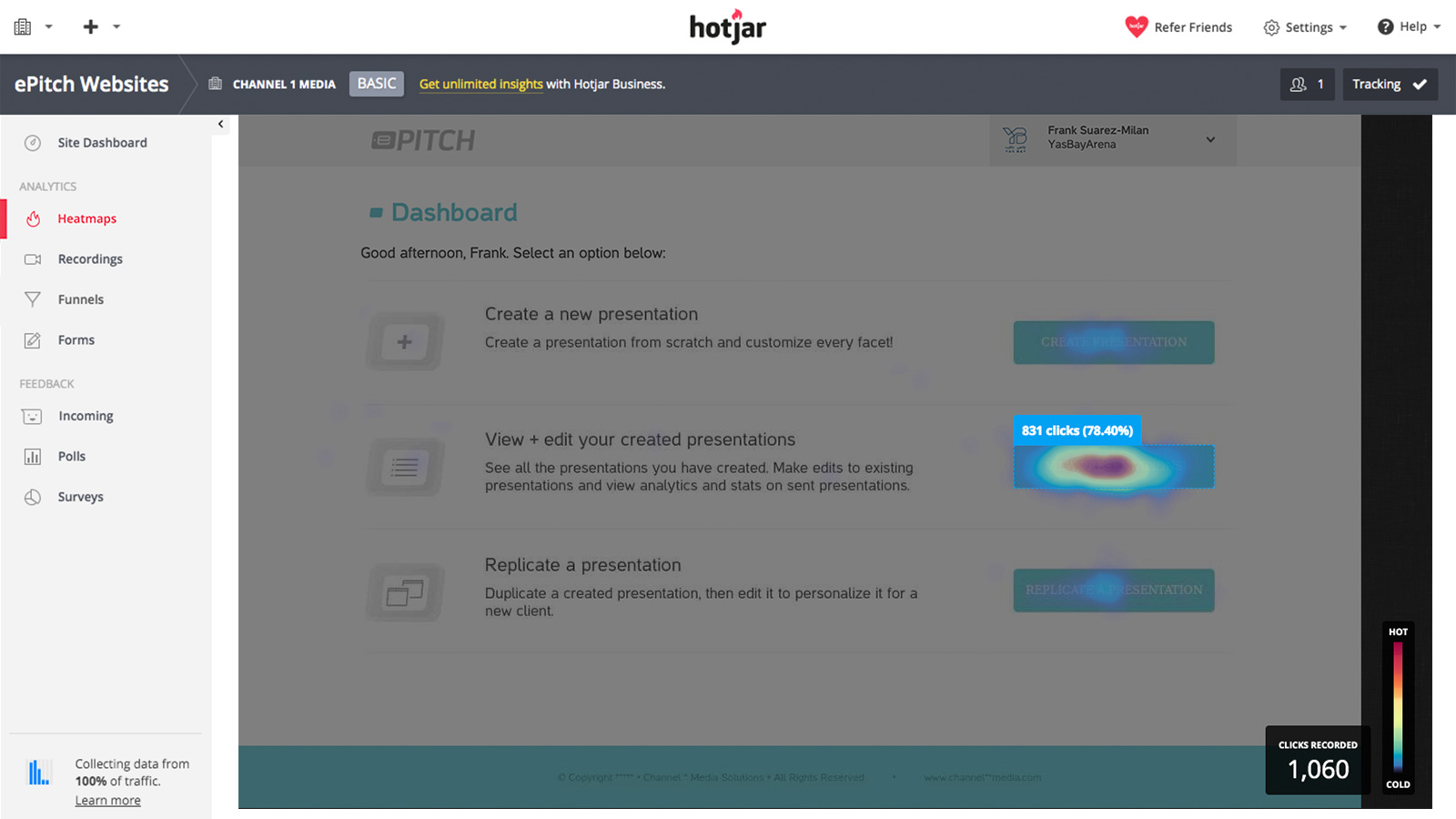
To begin, we looked at ePitch’s existing user data including heatmaps, conversion funnels, and anonymous session recordings. Despite intentions, most users began their journey by first viewing their presentations instead of creating one; often leaving the session shortly after.
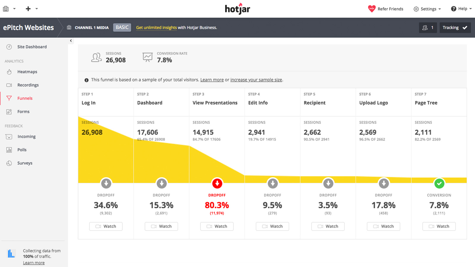
With implications of poor usability, our conversion funnels revealed an 80% drop off rate at the ‘View Presentation’ step. Though we speculated why, we interviewed these users in order to learn more.
Through this research we identified multiple areas of concern, such as over-the-phone onboarding, one-directional user flows, and number of steps required to convert. Facing a complete UI (User Interface) redesign, we decided to stagger implementation to better test each step of change and more clearly isolate the impact it made.
Hence, we chose first to focus on facilitating existing user behaviour. In other words, making the “View Presentation” step easier. With this in mind, we sought to design a dashboard that better met the needs of our users.

“I usually check existing presentations and prep before actually creating one.”

“I like to first get familiar with the content.”

“Viewing presentations gives me a sense of where I’m at.”
Through the collaborative efforts of the designers, developers, and executives, we brainstormed and narrowed down our directions to two concepts. Using interaction recordings, we then tested the two low-fi design prototypes against our existing dashboard and asked users to find a specific presentation—the task they most frequently performed.
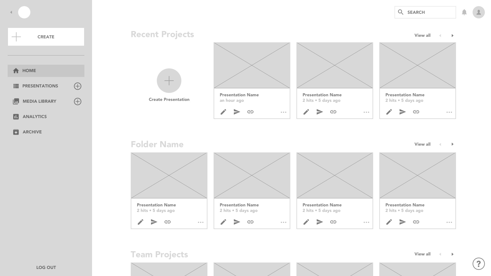
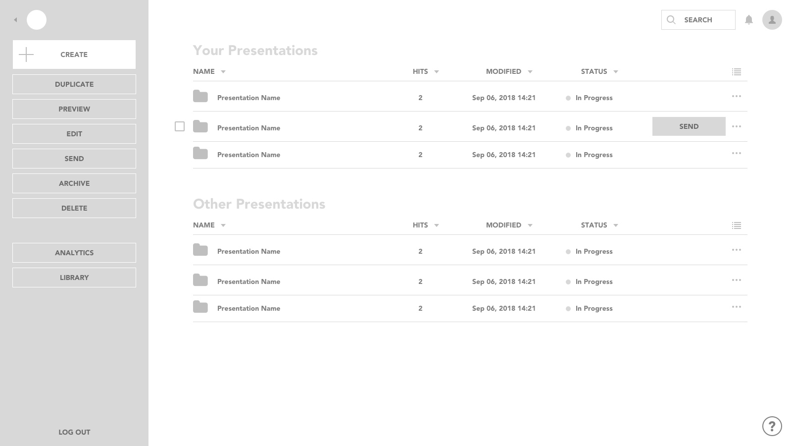
The results showed that the thumbnail version had the most positive design feedback. Users loved the large presentation thumbnails and access to features. Surprisingly, the trimmed-down list had the best discoverability and users loved the simplicity.
In the end, we decided to combine both approaches to achieve a balance of discoverability and delight. We found the thumbnails were best utilized for recent projects (making them easy to find) while the trimmed down list provided a hierarchy and sense of accomplishment.
Lastly, through a series of opt-in beta tests, we refined our designs to optimize for discoverability and engagement. This served the dual purpose of gathering data as well as selling the prospect of upgrading to the new version.

In the beginning, I looked at our conversion and drop-off rates with assumptions of usability issues. However, by identifying and facilitating existing user behaviours, ePitch doubled its conversion rates and increased engagement by 90%. This translated to more presentations created which in turn generated more sales for our users—not to mention for our company—when users upgraded.
It just goes to show that by gaining a deeper understanding of our user’s fundamental goals and motivations, we can not only better serve them, but our business as well.