Close
Role
Product Designer—creative direction, design, prototyping, and user testing
Client
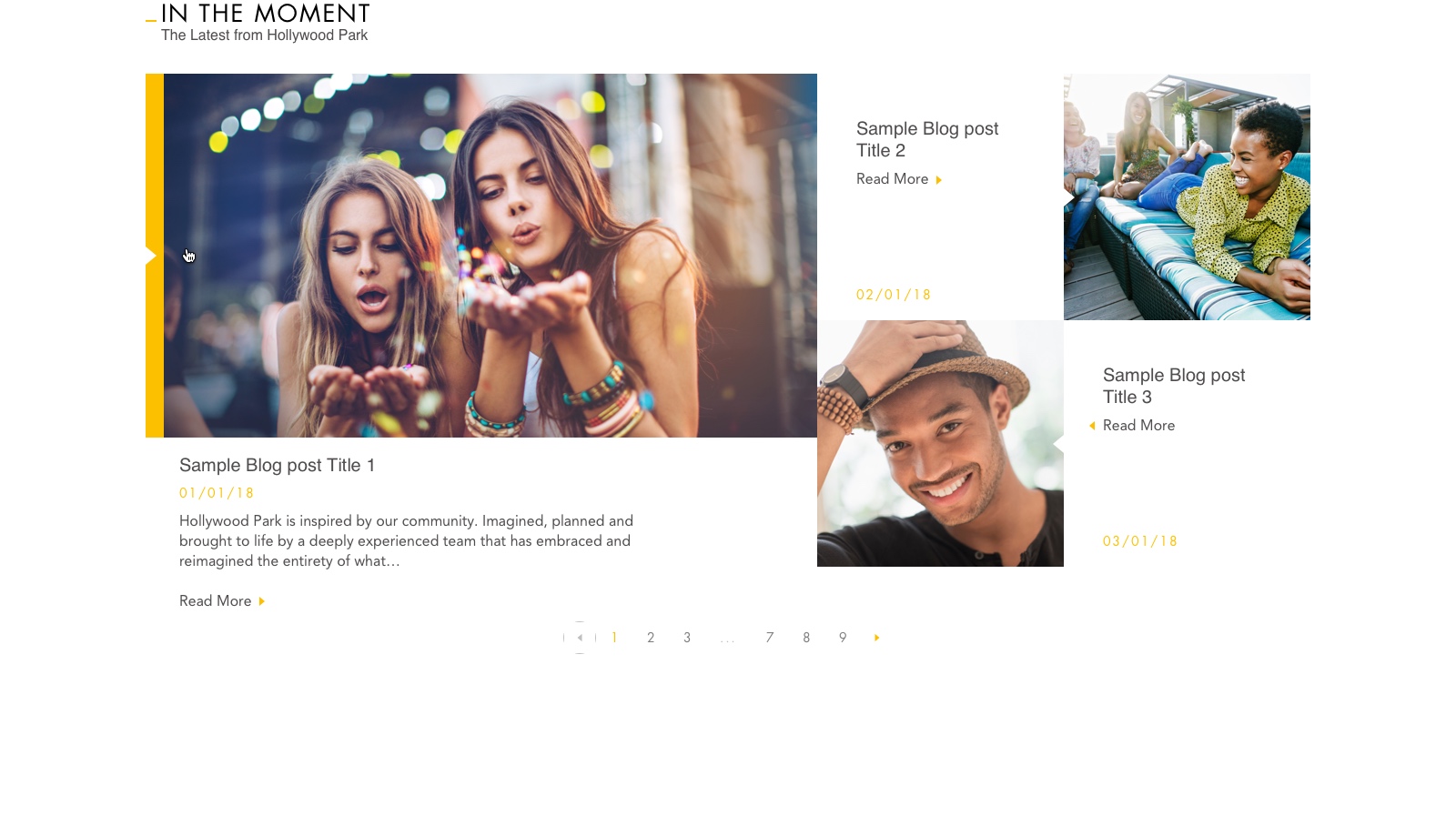
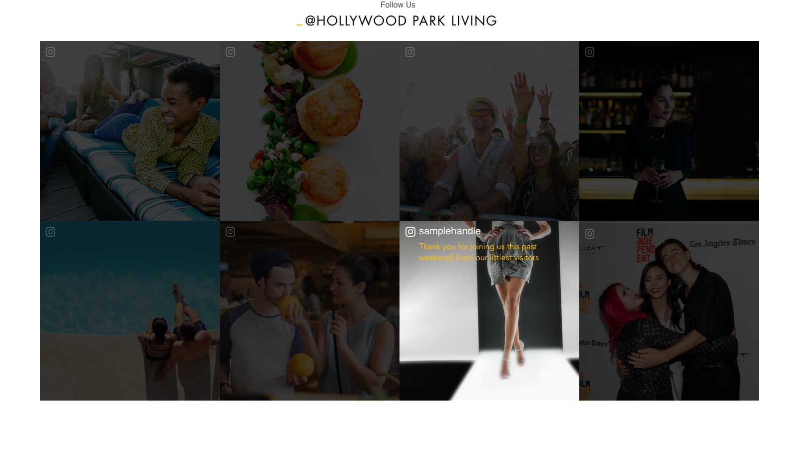
A development project that aimed to change the landscape of Southern California, Hollywood Park approached us to craft an online presence that was modern in both form and function. As such, we developed a minimalist website that conveyed the contemporary vision of the project through photography and illustration. Within the first week, the site had 5,000 unique visitors—each one a potential investor.
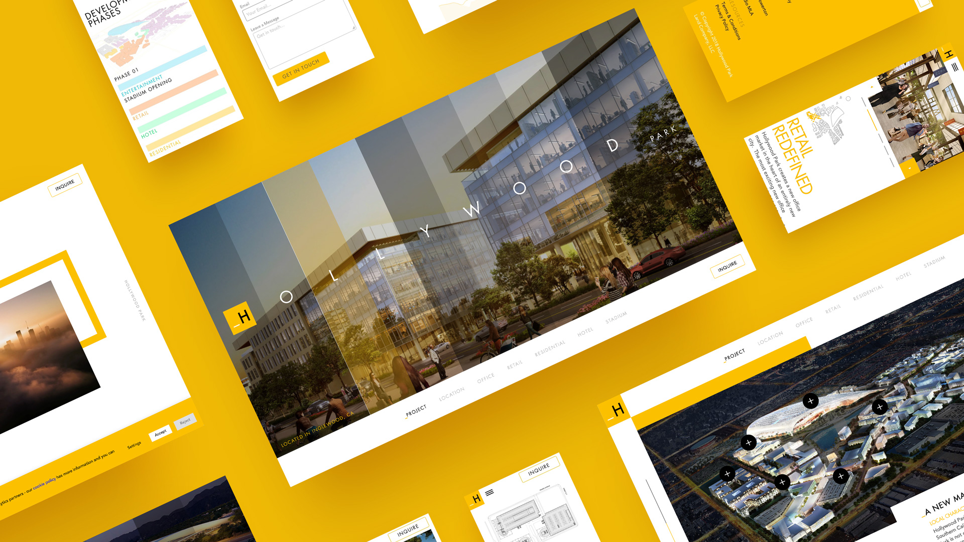
Hollywood Park is an entertainment complex and master-planned neighborhood consisting of over 8.5 million square feet. The site will house offices, retailers, condominiums, luxury hotels, and SoFi stadium—home of the L.A. Rams and L.A. Chargers.
With such a wide array of real estate offerings, Hollywood Park’s intended audience was just as vast. We outlined our target personas based on the surrounding Los Angeles area and characterized them by vertical.

OFFICE
Oscar

RETAIL
Rachel

RESIDENTIAL
Riley

HOTEL
Hilda

STADIUM
Steve
Following a creative meeting, we established Hollywood Park’s desire to emphasize its greenspace through a light and airy colour palette. We proposed an interface that reflected this aesthetic through water colour imagery and animations. The idea was for transitions to be “painted on” to reflect the picturesque nature of the area.
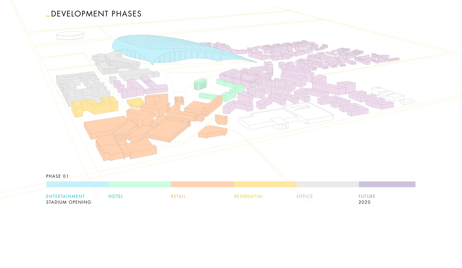
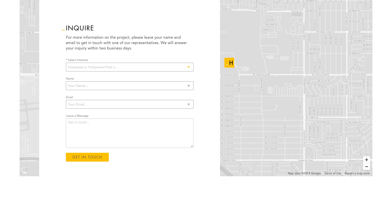
Despite our first pitch, an internal product brochure was subsequently created and the direction of the website changed. We ditched the green for yellow, water colours for clean lines, and redefined Hollywood Park’s brand identity. As an integral part of the project, we also needed to showcase the development phases and map the surrounding area. Thus, I created several vector illustrations and further expanded Hollywood Park’s visual vocabulary.
Finally, the layout of the website was designed with motion in mind. I created prototypes, interactive maps, and built transitions in After Effects. For the landing page, I designed interactive panels that highlighted the variety of spaces Hollywood Park had to offer. After which, we performed click tests on the interactive components of the site and further refined them.
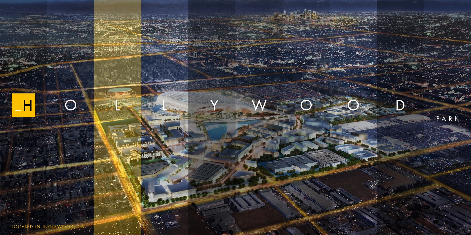
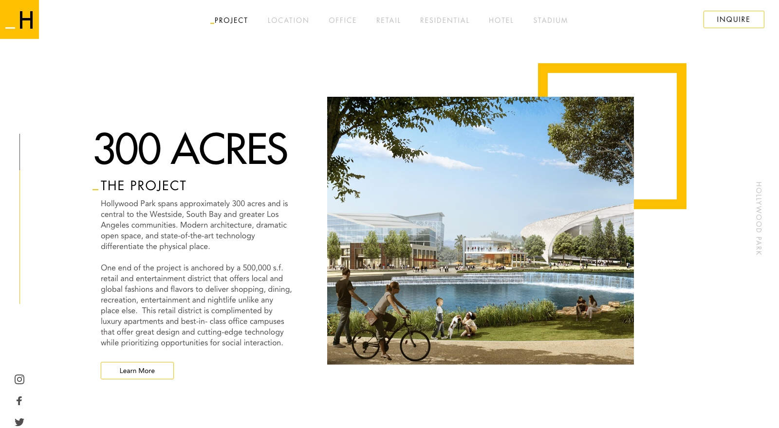
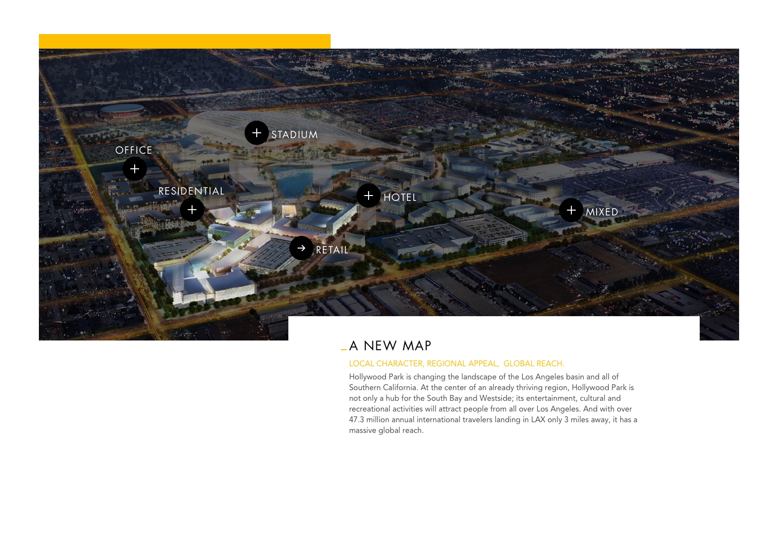

At the center of a thriving Los Angeles region, Hollywood Park tasked us with creating a memorable online experience for potential investors. Though a success in the end, the journey was not without misstep. Having lost valuable time course correcting, I learned to adapt quickly and commit to my decisions.
In the end, less was more. With a fast approaching deadline, our goal was to remove the unnecessary to make the experience as easy as possible. As author Antoine de Saint-Exupéry once said, “perfection is achieved when there is nothing left to take away.” And so, we developed a contemporary website for Hollywood Park that echoed simplicity. This resulted in 5,000 unique visitors within the first week, leading to millions in investments.